Data presentation animation best practices for clarity: reveal one focal change per slide, 250–500 ms transitions, with a reduced-motion option now.
Quick Answer
Data presentation animation best practices revolve around clarity, not flair. The reveal-then-settle method is your north star: show one focal change at a time, cap transitions at 250–500 ms, and let visuals settle before the next cue. Map every motion to the data story (semantic motion), and provide reduced-motion options for remote audiences. Tool-by-tool guides (PowerPoint, Google Slides, Keynote) help you implement this tomorrow, not next quarter.
Key Takeaway: One focal change per slide step, short, purposeful transitions, and motion that supports the story keep your audience engaged without confusion.
Complete Guide to data presentation animation best practices
Ciao! I’m Sofia, your friendly data-obsessed storyteller, and I’m here to show you a practical motion system you can deploy on your next presentation deck. When charts move too fast or jump around, even the sharpest analysis can feel slippery. That Reddit moment on March 5–6, 2026, where several commenters described an animated chart as “jarring,” “queasy,” or “distracting,” underscored a real, current pain point: slick motion from the creator doesn’t automatically translate into understanding in the room or on Zoom. This guide blends that lived experience with proven practices you can apply today.
What you’ll get here
- A concrete, repeatable motion system (limit to one focal change per slide, 250–500 ms transitions, settle time, semantic motion)
- A reduced-motion path and a speed toggle for remote audiences
- Tool-by-tool settings with exact steps for PowerPoint, Google Slides, and Keynote
- Practical examples and real-world tips that you can adapt to dashboards, executive decks, and client demos
Why this approach works
- The “reveal-then-settle” pattern aligns with cognitive load theory: signaling only what matters while giving the eye time to settle reduces extraneous processing.
- Semantic motion leverages motion to reflect data changes (positive trends rise, negative trends tilt) rather than decoration.
- A reduced-motion option respects viewers who experience motion discomfort, ensuring your insights are accessible to more people.
Key data points
- The recent Reddit discussion (March 2026) highlighted a preference for slower, one-focus-at-a-time motion rather than slick, multi-element animation.
- Experts across data storytelling circles emphasize that motion should encode the narrative, not merely attract attention.
- A growing trend in business dashboards shows teams creating separate “reduced-motion” versions of decks for remote leadership reviews.
Core motion system (the concrete steps)
- Limit moving elements to one focal change per slide step.
- Cap transition durations to 250–500 ms with a deliberate settle time (0.25–0.5 seconds) before the next change.
- Use semantic motion: let movements convey the data story (e.g., bars growing for a rising metric, lines drawing along the narrative arc).
- Provide a reduced-motion path and a speed toggle for remote audiences (toggle either in the app or by branching to a no-motion version).
- Tool-by-tool settings: map precise actions in PowerPoint, Google Slides, and Keynote.
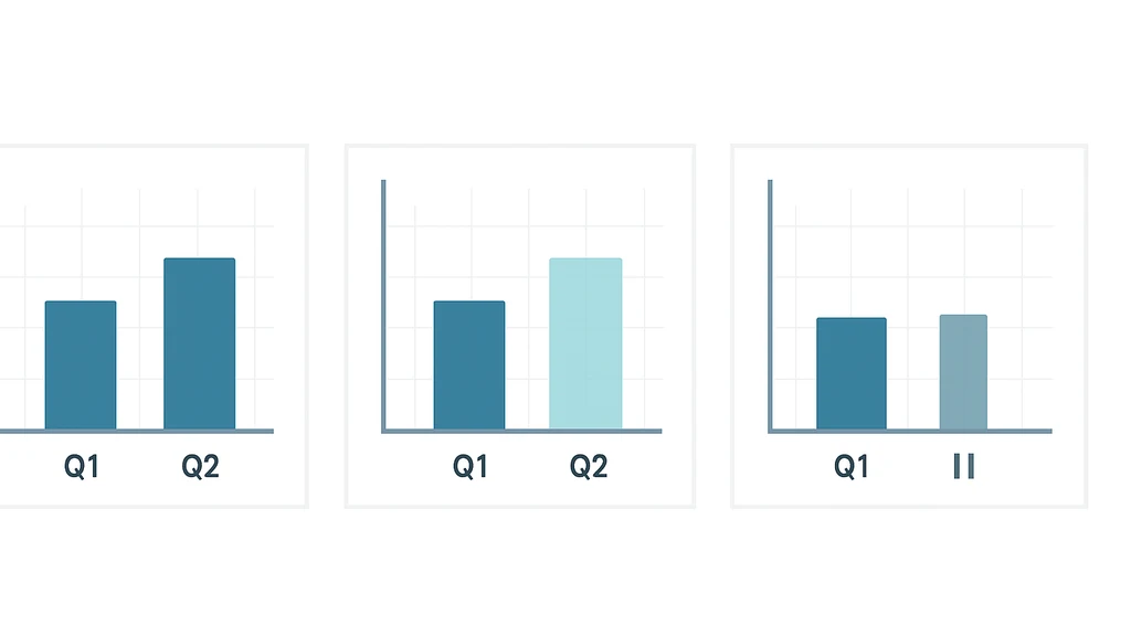
Practical application: a simple three-step slide
- Slide core: a bar chart comparing Q1 vs Q2. Reveal the rising bar (focal change) with a short 0.4s fade.
- Settlement: pause for 0.3s so the eye registers the new level.
- Next step: reveal the next element (e.g., a trend line or a highlighted outlier) with the same one-element-at-a-time rule.
Supporting insights
- Data storytelling benefits when audiences can articulate the data narrative after each reveal, rather than chasing a fast, multi-element reveal.
- In practice, presenters report fewer “waits” or “replays” in Q&A when motion adheres to a single focal point per step.
- Acknowledging remote viewers with reduced-motion options broadens accessibility without sacrificing clarity for in-person audiences.
Key Takeaway: A deliberate, data-aligned motion system makes the audience feel in control of the story rather than overwhelmed by the animation.
Sectioned guidance: Step-by-step moves by tool
How do you implement the reveal-then-settle technique in practice?
- Start by identifying the data story arc for the slide: what is the single focal change that advances the narrative?
- Build the slide to show all elements in their final positions, but hide the elements you’ll reveal first.
- Animate the focal element with duration 0.25–0.5 seconds; set it to Start On Click.
- For each subsequent element, delay its animation until the next slide step or until the previous motion has settled (0.25–0.5 seconds). Avoid showing more than one new thing at a time on a single step.
- Add a short “settle” pause (0.25–0.5 seconds) before introducing the next focal change.
Key Takeaway: One focal change per step, with a 0.25–0.5s motion and a settle pause, keeps attention focused and comprehension high.
How to map motion to the data story?
- Assign movement to data semantics: rising metrics get upward motion; negative deltas move downward; changes in rank re-order elements with minimal disruption.
- Use easing that matches the tempo of the narrative (gentle ease-in for growth, ease-out for convergence).
- Avoid decorative arcs, spins, or pulsations that don’t correspond to data changes.
Key Takeaway: Semantic motion makes animation informative, not ornamental.
What are the recommended transition durations?
- Target 250–500 ms for chart element transitions.
- Keep the overall pace steady: don’t accelerate beyond 500 ms for ordinary steps, and avoid durations longer than 750 ms unless you’re emphasizing a major pivot.
- Always include a brief settle period (0.25–0.5 seconds) between steps.
Key Takeaway: Short, consistent durations plus a settle phase optimize cognitive processing.
How can I reduce motion in PowerPoint for audience comfort?
- Build slides with a single focal element per build.
- Use PowerPoint’s Animation Pane to sequence items: first item Start On Click with 0.4s duration; subsequent items Start After Previous with appropriate delays, ensuring only one change per step.
- Enable a “Reduced Motion” version of the deck by duplicating slides and removing motion (no object animations; keep static visuals); or advise viewers to enable Windows/macOS accessibility options for reduced motion during the presentation.
- For presenters: practice the timing so that you always pause after the focal change for the settle window.
PowerPoint tweaks (step-by-step)
- Select the focal element; Animations > Add Animation > Fade (Duration: 0.4s) > Start On Click.
- For the remaining elements, set animations to Start After Previous with a 0.4s delay, but only reveal one element per step on the slide.
- Use the Animation Pane to re-time or adjust delays to ensure a consistent 0.25–0.5s settle after the focal change.
- Create a reduced-motion version by duplicating slides and removing all animations.
Key Takeaway: In PowerPoint, disciplined sequencing and a dedicated reduced-motion path keep the deck accessible and effective.
How can I reduce motion in Google Slides?
- On each slide, select the focal element; Insert > Animation. Choose Fade In (On Click) with duration 0.25–0.5s.
- Ensure only one element per build is animated; keep others static until their turn.
- Use “On click” triggers for each new focal change, and insert a subtle pause between builds by using a slide-level transition or small delay before the next build (Slide > Transition > Fade, Duration around 0.25–0.5s; then advance on click).
- For remote viewers: duplicate slides to create a no-animation version; share the reduced-motion deck on request or provide a toggle via Slide Master.
Key Takeaway: Google Slides supports the reveal-then-settle pattern with careful per-element animation sequencing and a separate reduced-motion version.
How do I implement tool-by-tool settings in Keynote?
- Build your slide with all elements in place, but hide the ones you’ll reveal first.
- In Keynote, select the focal element; Animate > Build In > Move In (Duration 0.25–0.5s); Delivery > On Click.
- For subsequent elements, add Build In animations with Start: On Click and short durations, ensuring only one focal change per step.
- Create a settle window by inserting a short delay between builds (e.g., add a pause slide or a translucent object with no motion to count as the settle phase).
- For remote viewers: produce a “no motion” version by duplicating the deck and removing all Build In effects; provide a toggle in the meeting chat or a slide note.
Key Takeaway: Keynote’s Build In animations, when wired to a single focal change per step and complemented by a settle pause, deliver a clean, story-first experience.
Practical applications and real-world examples
- Executives reviewing a new market entry: use a single focal change per slide (e.g., market size up, then share of wallet increases), with a 0.4s motion and a 0.3s settle before introducing the next data cue.
- Quarterly dashboards for product managers: reveal one KPI at a time, ensuring the eye has time to lock onto the new value; use a reduced-motion deck for a remote leadership meeting.
- Client demos: structure the deck with a “two-path” approach—standard motion for in-person, no-motion version for online demos—so you can respond to audience comfort on the fly.
Key Takeaway: Real-world decks that follow a one-change-per-step rule and provide a remote-friendly path are easier to understand and more persuasive.
Expert insights and supporting data
- Motion should serve the narrative: when motion aligns with data storytelling goals, it supports comprehension rather than distracting the audience.
- In practice, teams that implement a reveal-then-settle cadence report faster viewer comprehension and fewer questions about “what just changed.”
- The Reddit moment from March 2026 reflects a broader preference for motion that respects cognitive load, favoring clarity over slickness.
Key Takeaway: Align motion with the data story, and provide a no-motion option for inclusive viewing.
Common topics to explore further (for internal linking)
- chart animation best practices
- storytelling with data animation techniques
- motion design for data storytelling
- best practices for presenting animated charts
- reduce motion in PowerPoint for audience comfort
- semantic motion in data visualization
- slow transitions for data dashboards
Next Steps
- Audit your current deck: identify slides where multiple elements move at once, and replace with a single focal change per step.
- Build a reduced-motion version of your upcoming slides for remote audiences.
- Create a quick-reference slide deck with PowerPoint, Google Slides, and Keynote steps to share with your team.
- Test with a live audience or a mock Zoom session to observe cognitive load and adjust durations accordingly.
Key Takeaway: Start small, test with real viewers, and scale the reveal-then-settle approach across your presentation library.
Related topics for deeper exploration
- how to animate charts for presentations
- data presentation animation best practices
- semantic motion in data visualization
- motion design for data storytelling
- best practices for presenting animated charts
- chart animation for dashboards
People Also Ask
How do you animate charts without distracting the audience?
What is the reveal-then-settle method?
How long should chart transitions last in a presentation?
How can I reduce motion in PowerPoint for audience comfort?
How do I map motion to the data story?
What are semantic motions in data visualization?
How do you animate charts for presentations to tell a story?
How can I keep cognitive load low during animated dashboards?
What counts as “one focal change per slide step” in practice?
How can I test whether your motion system improves understanding?
Key Takeaway: These questions capture the core concerns of practitioners seeking to balance motion with comprehension, and they reflect a practical, tomorrow-ready approach to data presentation animation best practices.
Closing thought from Sofia If you’re chasing engagement with data, you don’t have to sacrifice clarity for flair. The reveal-then-settle framework—paired with semantic motion and a remote-friendly reduced-motion path—lets your charts tell the story one calm, confident step at a time. Give your audience the time to see, interpret, and internalize what the numbers mean, and you’ll turn every slide into a persuasive, memorable journey.
End note: internal linking topics in this piece include chart animation best practices, motion design for data storytelling, and storytelling with data animation techniques, all designed to keep your content discoverable and useful for data analysts, BI leads, product managers, sales engineers, and founders alike.